Failure Demand Is Eating The Service Desk Alive
A GZP Operator Playbook
The fastest capacity gain is not hiring. It is removing the contacts that should never happen.
TL;DR
• Many service organisations find a large share of demand is “failure demand”, caused by something not done, or not done right. (Vanguard Consulting Ltd)
• In command-and-control service designs, Vanguard cites failure demand often running 40–60% of total demand. (Vanguard Consulting Ltd)
• A practical target is to identify the top repeat drivers weekly, then validate and fix upstream.
• Automated classification and clustering can surface root causes in days, but only if the taxonomy, validation, and ownership model are clear.
• Measure success by reduced repeat contact rate and “progress chasing,” not just handle time.
Treat failure demand as a defect stream, not customer behaviour
Service teams often talk about volume as if it is weather. The calls came in. The tickets landed. The queue grew. The team worked harder.
That story breaks the moment demand is split into two types.
One type is the work the service exists to do. A customer wants a change. A user needs access. A resident needs a booking. That is normal demand.
The other type is demand caused by failure. Something did not work. Something was unclear. Something was late. Something was done wrong the first time. John Seddon’s work popularised the term “failure demand” and defines it as demand caused by a failure to do something, or to do something right, for the customer. (Wikipedia)
Once that split is made, the queue stops looking like weather. It starts looking like defects.
This matters because the scale is rarely small. Vanguard’s description is blunt: in conventional command-and-control service organisations, failure demand routinely runs at 40–60% of total demand, and in some settings can be higher. (Vanguard Consulting Ltd) Even when the number is lower, it is still costly.
A banking case study found measurable failure demand in contact samples and then traced portions of it back to the organisation’s own process issues. (Chalmers Publication Library (CPL)) Public sector research has also found sizeable avoidable demand in real systems, including a study that reported about 30% of non-urgent demand could be avoided in the setting examined. (Taylor & Francis Online)
So the working claim that 30–40% of contacts are “something didn’t work” is not a shock. It is often the norm.
The operational mistake is treating this as service demand to be handled faster. The better move is to treat it as a signal that upstream work is failing.
Why most organisations discover failure demand too slowly
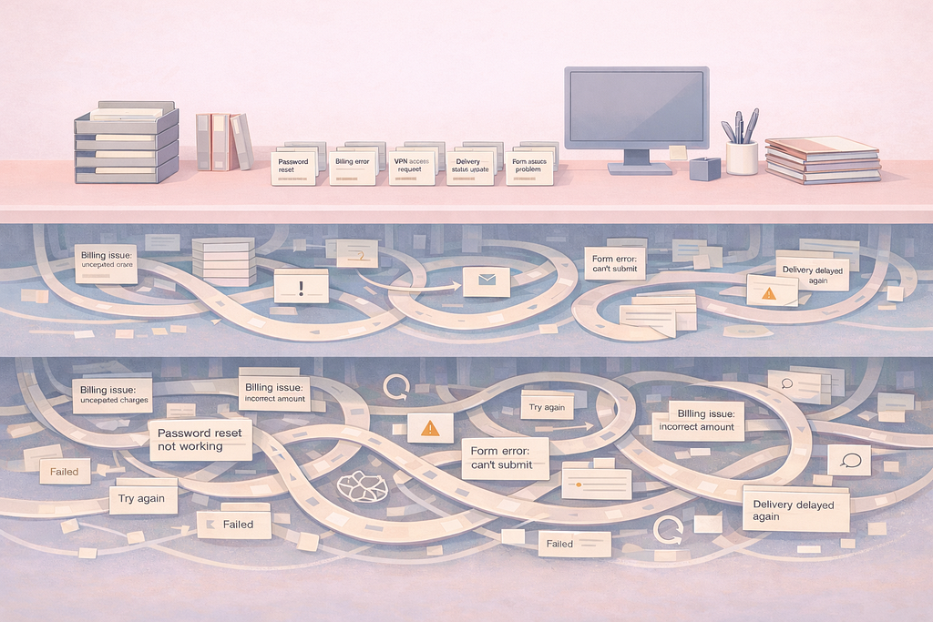
Most leaders can name the usual suspects. Password resets. Billing confusion. Status chasing. Form errors. Delivery updates. Access approvals stuck in loops.
Yet those same leaders often learn the true drivers late, after months of pain. The reasons are structural.
First, classification is weak. Tickets get broad categories. Agents pick whatever closes the form. The data looks tidy but says little.
Second, the analysis cycle is slow. Reports are built monthly or quarterly. By the time a pattern is proved, the pattern has shifted.
Third, ownership is unclear. Service teams see the pain. Product teams ship features. Operations teams own policy. Nobody owns the defect end-to-end. The result is a familiar loop: service absorbs the volume, the business calls it “support,” and the failure repeats.
Fourth, metrics reward the wrong fight. Average handle time, calls per agent, tickets closed per day. Those numbers can improve while the customer experience gets worse, because the same customers come back again and again.
Seddon’s example of a call centre discovering that a large share of calls were customers querying bills is a useful reminder. The centre had not even been looking at demand type. It was measuring activity. (agilier.com) That is common.
The fix is not a bigger reporting team. The fix is faster knowledge.
What “root causes in days” looks like in practice
“Root causes in days” can sound like a tech claim. In operations terms, it is simpler.
It means turning raw contact text into a ranked list of repeat drivers every day, then validating the top few drivers with real evidence, then assigning fixes with a named owner.
That is it. No magic. No waiting for the quarterly review.
The enabling change is that contact text is finally usable at scale. Calls have notes. Chats have transcripts. Emails have content. Tickets have summaries. When that text is consistently grouped, spikes appear quickly.
A good daily output looks like this:
- Top 20 failure-demand themes by volume and growth
- Example snippets for each theme, redacted for privacy
- Impact markers: repeat contact rate, transfers, reopen rate, time-to-fix
- Where it shows up: product, journey step, policy path, region, channel
- A short list of likely upstream causes, with confidence levels
- A “needs validation” flag for anything that might be noise
The daily output is not the decision. It is the starting point. Validation still matters, because service data lies in quiet ways. Agents paraphrase. Customers rant. Systems fail in bursts. The goal is fast direction, not instant truth.
When done well, a team does not wait for perfect categories. The team builds a tight loop: detect, validate, fix, measure.
Build a demand taxonomy that agents can actually use
Most classification schemes fail because they are designed for reporting, not for work.
A useful taxonomy has three levels:
- Intent
- What the customer tried to do. Pay a bill. Change an address. Reset access. Track delivery. Book an appointment.
- Break type
- What failed. Could not complete. Error message. Confusing step. No confirmation. Delay. Wrong outcome.
- Root cause candidate
- The likely upstream source. Form validation bug. Policy rule. Missing email. Broken integration. Content mismatch. Training gap.
This structure keeps the frontline label simple while still pointing upstream.
The second rule is to treat “other” as a defect. If “other” grows, the system is blind. A weekly review should shrink “other” by adding a new category or merging two messy ones.
The third rule is to separate “value demand” from “failure demand” early. This is not academic. It prevents the service desk from celebrating “deflection” that only hides failure demand in another channel.
Failure demand has a specific meaning. It is not “hard customers.” It is not “people who did not read.” It is demand caused by the organisation failing to make the service work as expected. (Wikipedia) When teams hold that line, the tone changes. The work becomes engineering and process control, not customer blame.
Put validation ahead of dashboards
Automated grouping can surface patterns quickly. It can also surface the wrong pattern quickly.
Validation keeps credibility intact.
A practical validation method is a 30-minute daily “demand huddle”:
- Pull the top 5 growing themes from the last 24–72 hours
- Listen to 3 calls or read 10 transcripts per theme
- Confirm the break type and the journey step
- Tag the theme as “real,” “mixed,” or “noise”
- For “real,” nominate a likely upstream owner that day
This does two things at once. It keeps the model honest, and it keeps leaders close to customer reality without turning it into theatre.
A second validation method is correlation with events:
- Releases and config changes
- Policy updates
- Email campaign sends
- Outages and latency spikes
- Partner incidents
If a contact theme spikes 24 hours after a policy change, the debate shortens. If a theme spikes with no event, the investigation goes to hidden changes like data drift, vendor issues, or a silent UI update.
Validation is also where “days not quarters” becomes real. A quarterly report can state a problem. A daily loop can catch the moment a break begins.
Fixes that reduce failure demand are usually small and dull
Large programmes are not required to cut failure demand. The biggest wins often come from boring changes that remove friction.
Common high-yield fixes:
- Form design: remove one confusing field, tighten validation, add an inline example.
- Status messaging: send a clear confirmation, add proactive updates, stop “no news” periods.
- Policy wording: replace internal language with plain language, align channels to the same rules.
- Knowledge content: fix one article that is wrong, not ten articles that are vague.
- System defects: remove one recurring error code, not a full redesign
- Handoffs: stop bouncing work between queues by aligning entry criteria.
The key is sequencing. Failure demand often clusters around a few journey breaks. Fix those first.
There is also a subtle point. Reducing failure demand does not just free capacity. It frees attention. Context switching drops. Training load drops. Escalations drop. The whole system calms down.
That is why failure demand deserves executive time. It is not a service metric. It is a system effectiveness measure.
Metrics that show real improvement, not activity
Activity metrics still matter for staffing. But they do not prove progress.
Better demand-reduction measures include:
- Failure demand share: failure contacts as a portion of total demand
- Repeat contact rate: same customer returning within 7 or 14 days for the same issue
- Progress-chasing rate: “where is my…” contacts as a share of total
- Reopen and transfer rates: signals that first resolution failed
- Contact rate per transaction: contacts per order, per claim, per account change
- Time-to-detect and time-to-own: how fast a new failure theme gets noticed and assigned
These measures keep the focus on the system, not the agent.
They also make the business case cleaner. If failure demand is a large share of volume, reducing it is capacity creation. Vanguard’s work frames failure demand as a major burden on capacity in many service organisations. (Vanguard Consulting Ltd) The arithmetic is not perfect because demand interacts, but the direction is clear. Less failure demand means fewer avoidable contacts and fewer second-order costs.
Data hygiene and privacy can be handled without slowing down
A fast loop does not require risky data handling.
Good practice is straightforward:
- Redact personal data from transcripts before analysis.
- Store only what is needed for grouping and validation.
- Limit access to the smallest team that needs it.
- Keep sample snippets short and anonymised in reports.
- Log who accessed what, and why.
The goal is to learn from patterns, not to inspect individuals.
This is also where trust with frontline teams is earned. If the work turns into agent surveillance, the loop dies. If the work is framed as system repair, participation rises.
Where this approach fails, and how to avoid the traps
A few failure modes show up repeatedly.
Trap 1: treating the grouping output as truth
Grouping is a lead, not a verdict. The daily validation step prevents false confidence.
Trap 2: building a taxonomy that mirrors the org chart
Customers do not experience departments. A taxonomy should mirror journeys and break types.
Trap 3: fixing only in the service layer
Better scripts can reduce handle time, but they rarely reduce failure demand. Fixes must land upstream: product, policy, process, comms.
Trap 4: moving demand to cheaper channels and calling it solved
If the same failure shows up in chat instead of voice, nothing improved. Channel shift is not demand reduction.
Trap 5: picking projects instead of picking defects
Large initiatives have long lead times. Failure demand work needs short cycles with visible drops in repeat contact.
Public sector examples underline why this matters. Research into demand management and failure demand has been applied in real settings like policing, with findings that a significant share of demand could be avoided in the system studied. (Taylor & Francis Online) The same idea travels well across industries because it is a service-system property, not a sector quirk.
The point is not faster analysis. The point is fewer contacts.
Failure demand is not a label to decorate reports. It is a way to see waste that hides in plain sight.
When 30–40% of contacts exist because something failed, service capacity is being spent on rework. Vanguard’s material goes further and notes that failure demand can be an astonishing burden in many conventional service designs. (Vanguard Consulting Ltd) That is why reducing it changes more than cost. It changes the feel of the operation.
Teams stop running. Customers stop chasing. Leaders stop debating opinions and start debating evidence.
And when the loop is tight, root causes do not need a quarter to emerge. Patterns show up in days, because the data is already arriving every hour. The work is simply to listen to it, group it, validate it, and fix what it points to.
If a specific industry context is in scope (IT service desk, utilities contact centre, health admin, internal HR ops), the same structure holds. Only the taxonomy changes.
Failure Demand Is Eating The Service Desk Alive was originally published in GZP Blog on Medium, where people are continuing the conversation by highlighting and responding to this story.